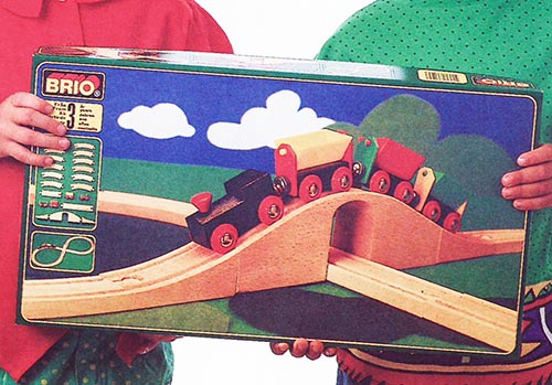
One of the many things I loved about the early 90’s BRIO catalogs and retail boxes is the layouts used in the product photos. There was a very minimalistic approach to creating a landscape for the railway system, consisting of felt cutouts and painted backdrops to represent the sky, ground, and water, such as on this product photo taken from the 1991 catalog:
I’ve been building my layouts on a laminated table surface for many years, using a Wilsonart laminate in hunter green to represent the ground, but only recently have I turned my attention to trying to represent water in my scenery. As much as I love the look of the laminate, having boats sailing on a sea of green needed to change. But what to do?
BRIO’s approach of using felt really resonated with me, but it was also the opposite of what I needed. They started with blue water as their base and built up the land around it, where I was starting with land and needed to overlay a water look on top of it. Felt is simply too thick. David Harper’s approach was to use plastic table covers in green and blue, but his layouts span multiple tables and he’s covering a much wider area. I needed something just as thin, only smaller in size.
What I settled on was colored cardstock. Specifically, the 12″ square cardstock used for scrapbooking, and available at arts and craft stores and sold as loose sheets. I chose a light blue color, specifically one called “powder blue” at Joann Fabrics, so that it would contrast against the darker green of my table top. Cardstock is thick enough to be durable but thin enough that overlapping sheets still lay reasonably flat.
Taking inspiration from BRIO, I cut several of my cardstock pieces into circles using a large circle cutter—I recommend the Martha Stewart Crafts Circle Cutter for this task as it doesn’t create a hole in the center of the disc—creating several circles that were 11.5″, 9.5″, and 6″ in diameter to give me multiple sizes to work with. I also created two more of the large 11.5″ diameter circles and split them in half with a paper cutter so that I could start the water along the edge of my table. (I also left some sheets as squares, and cut some into 3″x12″, 6″x12″, and 9″x12″ rectangles for modeling water along table ends.) Finally, for extra durability, I had them hot laminated.
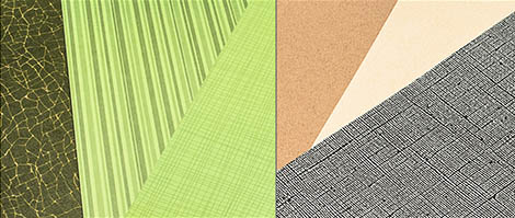
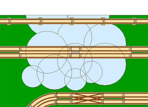
To create the water effect, start with the half-circles at the edge and then overlap the larger circles to expand the lake or river, filling in with the smaller ones to eliminate gaps and finish off the edges. Adjust circles as needed, adding the smallest ones along the edges until you are satisfied with the look. Here’s a layout plan using SketchUp with the edges turned on to show the circle placement:
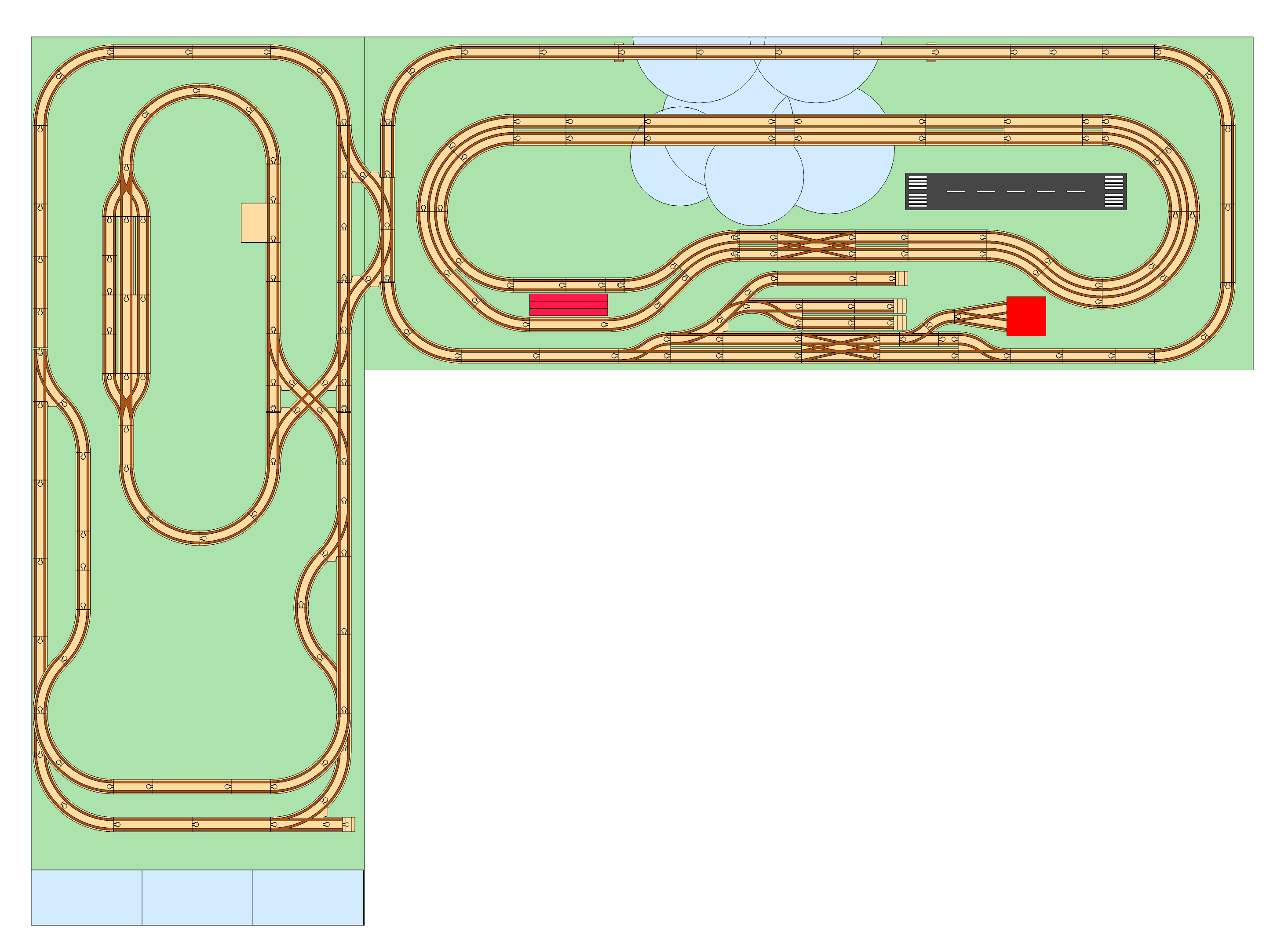
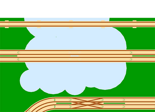
And without the edges to better represent the final look:
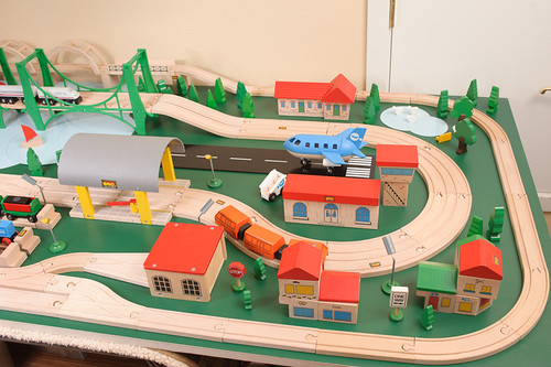
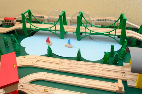
And this is what final effect looks like in a (not-yet-complete) layout:
The beauty of the scrapbook cardstock approach is that it’s cheap and the paper is available in a wide variety of colors, some even with abstract textures. You can even use craft techniques such as sponges and paints to add your own texture effects to the paper. You aren’t limited to water, either, and can use other colors and textures to represent different types of land.
Perhaps best of all it’s also a wood product, which is in the spirit of your wooden railway system.